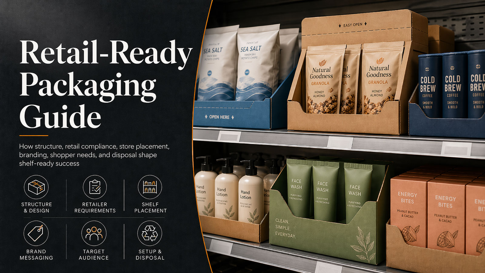
When you're ordering a corrugated POP display from a manufacturer, one question almost always comes up: Should I specify CMYK or Pantone colors? The answer directly affects your display's visual impact, brand consistency, and total production cost. Understanding how each system works — and where each one falls short — will help you make the right call before submitting your artwork file.
Two Different Philosophies of Color
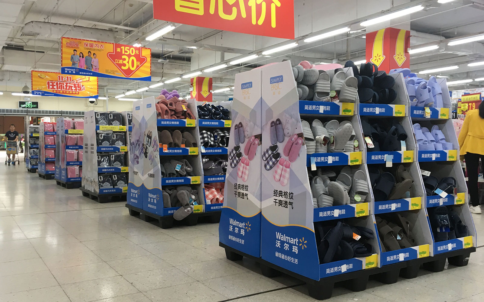
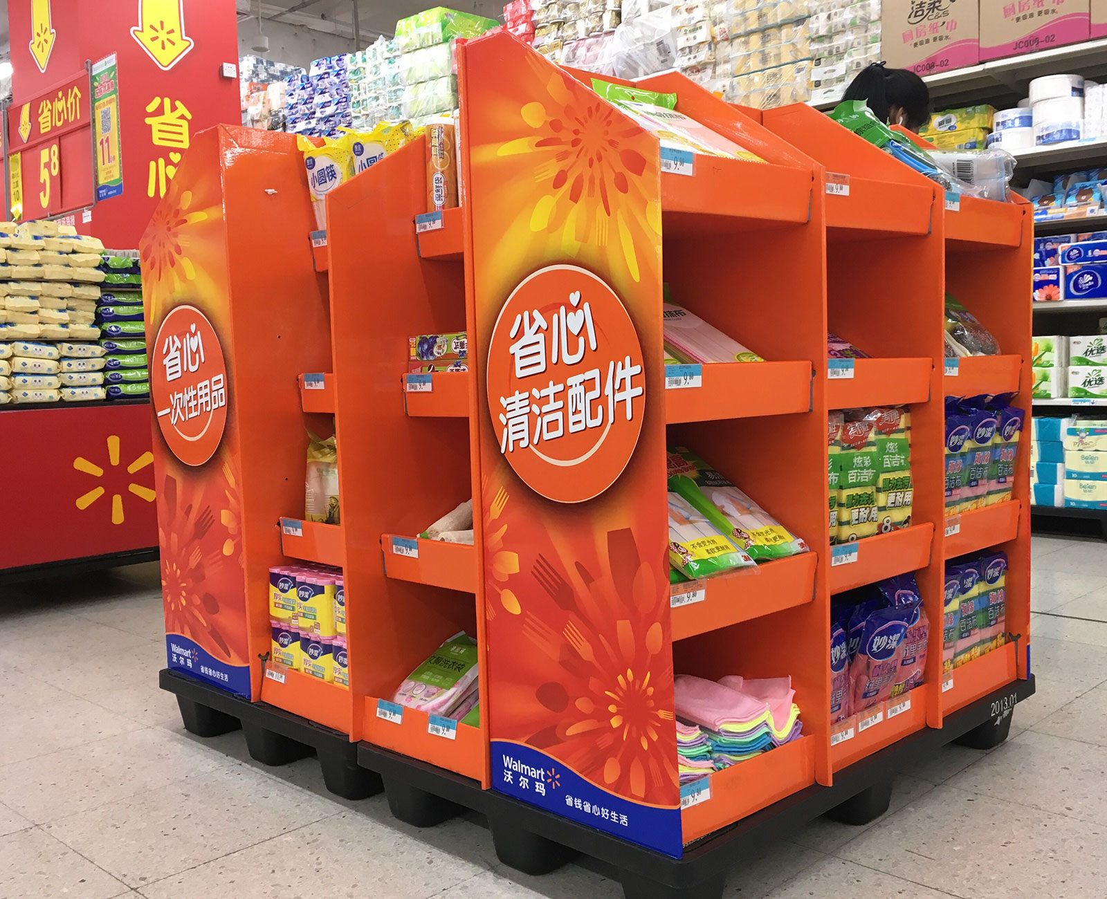
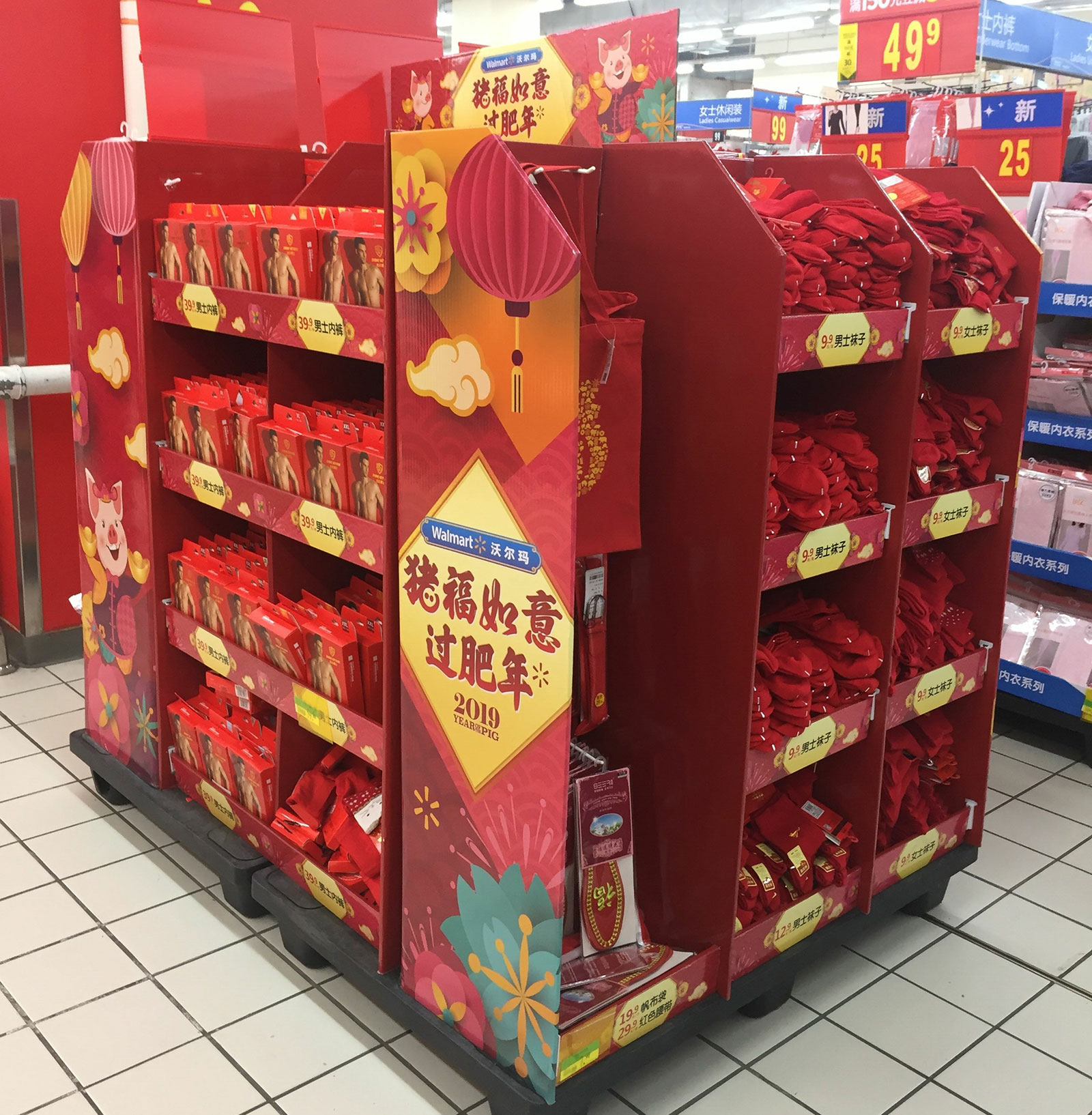
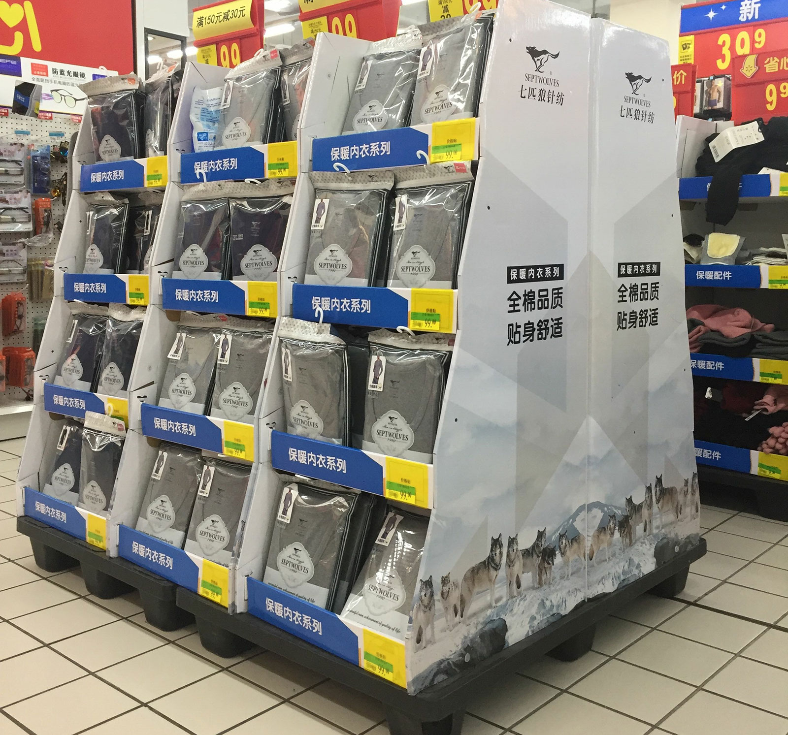
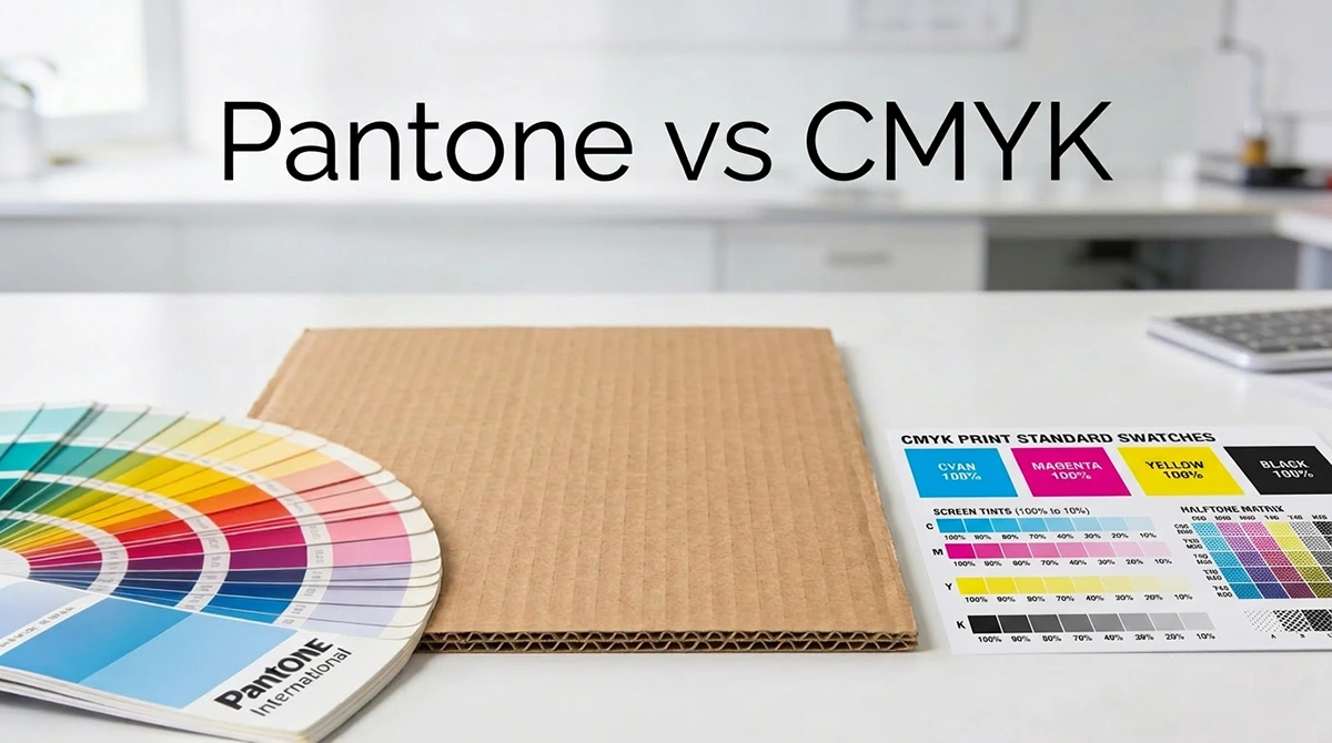
CMYK stands for Cyan, Magenta, Yellow, and Key (Black). Rather than using a single pre-mixed ink, this process builds color by layering four base inks in varying dot patterns on the press. When viewed from a distance, the overlapping dots blend visually into a near-infinite range of hues — making CMYK ideal for photorealistic product photography, lifestyle imagery, and complex multi-color graphics. Because every commercial corrugated press is already configured for four-color output, CMYK carries no special setup requirements and remains the industry default for full-color display printing.
Pantone (PMS — Pantone Matching System) takes the opposite approach. Each Pantone color is a pre-formulated ink mixed to a precise recipe before it ever touches the press. The result is a single, standardized color that looks identical on any press, in any factory, in any country — whether your display is manufactured in Guangdong, Mexico City, or Ohio. This makes Pantone the preferred system for brand colors that must be consistent across every touchpoint: retail displays, packaging boxes, shelf strips, and printed signage all sharing the same Pantone code will match perfectly under any lighting condition.
Cost vs. Color Accuracy: The Real Trade-Off
The fundamental tension between the two systems comes down to this: CMYK is more economical and versatile, while Pantone delivers superior accuracy and brand consistency at a higher cost.
With CMYK, your manufacturer uses a standard four-plate setup that requires no additional tooling or custom ink preparation, which keeps upfront costs low. The trade-off is that color output can vary slightly from run to run depending on press calibration, ink viscosity, and paper absorption — a minor variance that most seasonal or promotional displays can tolerate. Pantone, on the other hand, requires an extra printing plate for each spot color added, plus a custom ink mix and a press wash-up fee between colors. For a design using three or more Pantone inks, those additional costs accumulate quickly. However, for a simple logo or brand mark using just one or two flat colors on a large production run, Pantone can actually become cost-competitive once the setup cost is spread across a high unit volume.
The corrugated surface itself adds another layer of complexity that many buyers overlook. Unlike coated paperboard or plastic substrates, kraft liner is porous and slightly textured, which means it absorbs ink unevenly. CMYK colors can appear noticeably darker or less saturated on a corrugated surface than they appear in your digital mockup — particularly with bright oranges, vivid greens, and certain blues. Pantone spot inks are formulated with higher pigment concentration specifically to compensate for this absorption effect, delivering stronger and more opaque color on the board surface. If your brand uses a vibrant, non-negotiable shade, this surface behavior is a compelling argument for specifying at least that element in Pantone.
Choosing the Right System for Your Project
The decision ultimately depends on the nature of your artwork and the importance of brand color precision. If your display features full-color product photography, gradients, or more than three or four distinct colors, CMYK is almost always the right choice — both technically and financially. Attempting to reproduce a photorealistic background in Pantone would require an impractical number of spot inks and would cost several times more than standard four-color printing.
Pantone justifies its premium when brand color accuracy is non-negotiable. Trademarked colors — the precise red of a global beverage brand, the distinctive teal of a luxury retailer — simply cannot be reliably approximated through CMYK dot mixing, and a brand compliance team will reject any display that falls outside the approved color range. In these cases, specifying the exact Pantone code (e.g., PMS 485 C) in your artwork file and RFQ document eliminates ambiguity entirely and protects both you and your manufacturer from costly reprints.
Many experienced buyers find the most practical solution is a hybrid approach: printing the full display graphic in CMYK for cost efficiency, while specifying one or two critical brand elements — a logo, a headline color, a key call-to-action — in a Pantone spot color. This strategy keeps the budget under control while ensuring the most brand-sensitive elements are reproduced with precision. It does require advance coordination with the manufacturer, since the press needs to be configured for both process and spot color printing from the start.
Our Factory Capabilities
We operate a fully integrated corrugated display manufacturing facility with in-house pre-press, printing, die-cutting, and assembly under one roof — giving us direct control over color quality at every stage of production.
Our printing floor is equipped with both 6-color offset lithographic presses and flexographic printing lines, allowing us to handle everything from high-resolution full-color CMYK artwork to simple two-color spot-ink runs with equal precision. For Pantone specification projects, our pre-press team works directly with the Pantone Formula Guide to mix inks to standard before each production run, and we conduct spectrophotometer verification against your approved Pantone code before full production output.
We understand that corrugated board is not a forgiving substrate for color-sensitive work. That is why every first-time order — regardless of print method — includes a physical color proof on actual production board stock for your approval before the full run begins. This step catches surface absorption shifts early and ensures the display you receive matches the display you approved. For repeat orders with established color profiles, we maintain your press settings and ink formulas on file to guarantee consistency across reorders, even months apart.
Whether your project calls for CMYK efficiency, Pantone precision, or a hybrid of both, our team will advise the right printing specification for your brand standards and budget during the artwork review stage — at no extra cost.
One Step Before You Place Your Order
Before finalizing your artwork, confirm two things with your manufacturer: the exact color specification method (CMYK values or Pantone code), and whether a physical proof is included in the quoted price. Misaligned color specs are among the most common — and most avoidable — causes of reprints and shipment delays in corrugated display orders. Providing clear, written color references from the start protects your timeline and your brand.
Ready to start your next corrugated display project? Send us your artwork and brand guidelines, and our pre-press team will review your color specifications and recommend the best print method ASAP.